Vyond Improvement Secrets Part 1: Making and improving the Character
Hello, guys! Since I have departure from making vyond videos over nightsingers, I decided to make some easter egg tutorials instead. Yeah, you know about Daniel Fuenmayor Ledesma's Vyond Content is very great! I became a big fan of DFL and I became inspired by making my own videos before. If you want to be Daniel Fuenmayor Ledesma or Glyris (me) in making the videos, I'll make a tutorial for you all!
Before starting to improve the videos, let's decide to the characters first. Even these poorly made characters look bland, let's start to improve the characters.
Making The Characters
1. Open the vyond character maker.
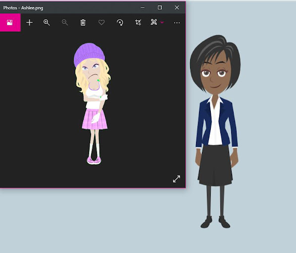
2. Use a reference vyond files on Goanimate V2 wiki. I am using Ashlee White from, Cubika as an example. For prenium and essential members, you can improve the design and color to replace old ones.
3. Change the skin color according to the reference file if you using. Thus I recommend you some presets of skin colors below. Red squares show the presets of the colors. Use this since it is quiet important to make the videos look new.
You can see below that the color is absolutely the same that this one.
4. Let's go to the hair first and let's select one that refer to the picture you using.
As you see in the picture that ashlee's hair is light blond. The colors are only stand on the edges of the color square.
Take the pictures examples below. The dull colors are make them old while bright colors make them new.
5. Let's proceed to the eyes, let's click the right eye according to the reference. Change the color into same color. *Sorry that Ashlee's eyes should be blue rather pink.*
Now let's proceed the Easter eggs of the eye, the eyelids! Click the second box between the main color and the eye lashes.Let's change the color of the eyelids as a makeup eyelids (for girls only) by responding colors.
Other characters had eyes with different color. This one example shows this.
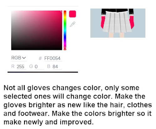
6. Let's change the tops and give the right color according to the reference sheet. Make sure the colors are brighter than the old suggested colors! Give the gloves if necessary if he/she in a factory job, a troublemaker, a hero or a player in cubika!
8. Let's finally change the footwear and make the colors brighter!
Now Ashlee's creation is finish! Compare to the reference sheet. If there is mistake, edit and balance the bright colors.
Bonus!
When you tried to use accessories, you must follow the pattern of the accessories so it would look not messy.


Well, i will pretty do that glyris. It such graphic alike anime.
ReplyDelete@Mary Rose That's right Mary!
Delete